Customising
inkBoard also allows adding custom elements and functions relatively easily.
Both can be parsed, in the appropriate places, using the custom: identifier.
This page is a small reference on writing your own custom elements and functions.
As a reference, these files are included in the example configuration in the designer repo.
For this part of the tutorial, some experience with coding in Python can be useful to fully understand what is going on.
Custom Functions
To get started, in the folder where your configuration file is located, navigate to custom/functions.
You can create these folder if they do not exist yet.
In the functions folder, create a new file custom_functions.py.
Lets start with importing the necessary modules.
From inkBoard.elements, the elements that will be used within functions are imported.
From inkBoard.decorators, the elementactionwrapper is imported.
This is a decorator that can be used to easily allow functions to be used as element actions, without requiring the parameters that are usually passed.
In line 8, the inkBoard CORE object is imported. This object holds all objects of the current running configuration, like CORE.screen, CORE.device and CORE.config.
Type hinting is in place, so getting information on the objects attached to it is relatively straight forward with an IDE.
Lastly, under TYPE_CHECKING, a few modules are “imported” for type hinting.
This generally makes it a bit easier to code functions, since it makes it easier for an IDE to show what properties, functions and the like are available for an object.
Keep in mind that imports under TYPE_CHECKING must be wrapped in quotation marks when referencing them.
 1from typing import TYPE_CHECKING
 2
 3from datetime import datetime as dt
 4
 5from inkBoard.elements import Button, PopupMenu, Icon, GridLayout
 6from inkBoard.decorators import elementactionwrapper
 7
 8from inkBoard import CORE
 9
10if TYPE_CHECKING:
11    from inkBoard.types import InteractEvent
12
13
Note
Under the hood, inkBoard dashboards are made using the PythonScreenStackManager module. This module is developed alongside inkBoard, but for simplicity inkBoard has equivalent modules that link to the appropriate PSSM module. Importing directly from PSSM should not be necessary for most basic custom functions and elements, however some references to the module may be made in the tutorial.
First off, make a function that will update a button to show the coordinates you tapped on.
The coordinates can be extracted from the InteractEvent.
Subsequently, call element.update to update the element that was tapped on.
The update function takes a dict under updateAttributes, which indicates which properties to update to what value.
By giving it a text key, the element’s text property will be updated to the new value.
1def my_function(element: Button, interaction: "InteractEvent"):
2    """A very basic custom function.
3
4    Attach it as a tap_action to a Button element.
5    When tapped, its text will to display the touched coordinates.
6    """
7    (x,y, _) = interaction
8    element.update({"text": f"You touched coordinates {(x,y)}"})
Tip
Custom functions can also be async (preferably so, even). The screen takes care that functions do not block the event loop.
Some base functions, like update also have async equivalents, like async_update.
To now assign the function to an element, we can set the tap_action of my-button to custom:my_function.
When running the config, you will see that my-button now shows the coordinates when you tap it.
- type: Button
  id: my-button
  text: Hello World!
  font_color: white
  font_size: 0
  fit_text: true
  font: default-bold
  tap_action: custom:my_function
The elementactionwrapper may be useful if you want to use a certain function in multiple places, or for multiple purposes.
It catches out the element and interactevent from the function call, and subsequently calls the function with everything else.
For now, a simple function that prints the network the device is currently connected to will suffice.
The network can be accessed from the CORE object, via the device attribute.
Be aware that accessing the network is only available on devices that have that feature.
elementactionwrapper¶ 1@elementactionwrapper
2def my_print_function():
3 """A basic custom function using the `elementactionwrapper` decorator.
4
5 It also shows how to interface with the inkBoard core,
6 which holds the core components for a running config.
7 This includes, for example, the screen instance, a dict with all integrations,
8 and as can be seen below, the device instance.
9 """
10 if CORE.device.has_feature("network"):
11 network = CORE.device.network.SSID
12 print(f"Connected to {network}")
13 else:
14 print("The device does not have the network feature :(")
Assigning it to an element can be used in the same way as my_function.
Important
Custom functions can be defined in python files and modules in the custom/functions folder.
inkBoard collects all functions from all files, as well as functions in the __init__.py file in modules.
Custom functions can be used by calling them via the identifier custom:
Custom Elements
To use custom elements, a similar approach is taken as for custom functions.
In your config directory, create the folder custom/elements.
In there, create the file custom_elements.py.
Making custom elements is a bit less straightforward than a custom function.
All elements in inkBoard are directly based on images, meaning the screen expects an instance of Pillow’s Image.Image.
Custom Layout
A better starting point may be to create a custom Layout based element, since that means you can use all the base elements provided.
For this, the LabeledElements from the tutorial will be recreated.
This element is based on the GridLayout, but additionally puts a label under each element to show the name of it.
Start off with importing the type of element the custom element will be based on.
For the LabeledElements, that is a GridLayout.
from inkBoard.elements import GridLayout, Layout, Element, Button
The element itself should be able to be interchangable with a GridLayout, so no new properties or arguments will be introduced.
The GridLayout expects a list of elements to put into the grid.
This is all that will need to be changed, for which the __init__ method will need to be overwritten. Hence, start by defining your own.
Instead of the elements provided in the configuration, the elements should be the element from the configuration plus a label.
That will be done using the create_element_label function, which will be defined later.
What is will do is get an element, and return another one that is the labeled version.
The create_element_label is called for each element from the config, which is passed via the elements argument.
Every labeled element is subsequently put into its own list, and that list is the one that will be passed to the GridLayout.
LabeledElements in custom_elements.py¶1class LabeledElements(GridLayout):
2
3 def __init__(self, elements, **kwargs):
4
5 labelelts = []
6 for elt in elements:
7 labelelts.append(self.create_element_label(elt))
8
9 super().__init__(labelelts, **kwargs)
To create the label, you will need to determine a few things.
What element will display the label?
How will the element and the label be combined
What properties of the original element need to be copied?
The first one is relatively straightforward. Button elements display text.
For the second question, well, a Layout element can be used to create a layout with the two elements.
The third question is less easy to answer, and also depends on your own wishes.
Obviously, the name of the element needs to be retrieved, in order to display it on the label.
It may be useful to copy the tap_action as well, such that label can be pressed too, with the same result.
Since elements in a GridLayout can be directly assigned to a cell, those attributes should be copied to the label element as well.
With this in mind, the function can be written as follows:
1 def create_element_label(self, element: Element) -> Layout:
2 elt_name = getattr(element,"label_text", element.__class__.__name__)
3
4 label = Button(elt_name, fit_text=True, radius="h*0.15", background_color="white", tap_action=getattr(element, "label_tap_action", None))
5
6 id = f"{element.id}_layout"
7 labellayout = [["?", (element,"w")], ["h*0.2", (label, "w")]]
8 return Layout(labellayout, id=id,
9 grid_row=getattr(element,"grid_row", None), grid_column=getattr(element,"grid_column", None))
Line by line, the following steps are taken:
line 1The function is defined. It only needs an element as parameter, which will be wrapped in a label.line 2Gather the name for label. If the element has the propertylabel_text, that property will be used for the label. Otherwise, the name of the element’s class will be used.line 4Create theButtonelement that will function as the label. The properties can be set just like you would do in YAML. Check for alabel_tap_actionproperty in case a custom tap action is desired.line 6Use the element’s id for the labeled container’s id. Makes it easy to reference it if needed.line 7Create the layout matrix for the label container. A layout matrix is made up a list containing more lists. Each subsequent list is a row in the layout. The first entry denotes the rows height, every subsequent entry must be a tuple with an element and a dimension to denote its width. Hence, this layout has two rows. The top row contains the element itself, the bottom row contains the label.line 8 & 9Create theLayoutelement and return in. Pass all the required parameters, and optionally copy the element’sgrid_rowandgrid_column.
Now, the element can be used as a layout in YAML as follows:
- type: custom:LabeledElements
elements:
- type: Button
text: Hello World!
fit_text: true
radius: h*0.1
background_color: inkBoard-light
- type: Icon
icon: mdi:shape
background_shape: circle
background_color: inkBoard-light
The full LabeledElements class
1class LabeledElements(GridLayout):
2
3    def __init__(self, elements, **kwargs):
4
5        labelelts = []
6        for elt in elements:
7            labelelts.append(self.create_element_label(elt))
8
9        super().__init__(labelelts, **kwargs)
10
11 def create_element_label(self, element: Element) -> Layout:
12 elt_name = getattr(element,"label_text", element.__class__.__name__)
13
14 label = Button(elt_name, fit_text=True, radius="h*0.15", background_color="white", tap_action=getattr(element, "label_tap_action", None))
15
16 id = f"{element.id}_layout"
17 labellayout = [["?", (element,"w")], ["h*0.2", (label, "w")]]
18 return Layout(labellayout, id=id,
19 grid_row=getattr(element,"grid_row", None), grid_column=getattr(element,"grid_column", None))
From Scratch
The labeling all pretty convenient, but it doesn’t really do anything you couldn’t do in YAML by hand.
To get a better grasp for designing elements, lets create one from scratch.
This element will function as a toggle, meaning it will switch between an on and off state when tapped on.
First, import the modules, decorators, classes and types that will be needed.
DrawToggle¶1from PIL import Image, ImageDraw
2
3from inkBoard.decorators import colorproperty, elementaction
4from inkBoard.styles import Style
5from inkBoard.types import ColorType
6from inkBoard.helpers import DrawShapes
A toggle element actually already exists, the Toggle element.
However, that one is based on the Icon class.
To create one from scratch, it will be based on the base Element element.
This class, as stated in the documentation, will throw an error when used as is.
To make an element functional, it will need a generator method. This method generates the image file that displays the element.
More on that later. First the class itself will need to be defined. To do so, you should determine a few things.
What will the element be named?
How many colors will it have and which properties will be connected to them?
Should the element have specific element actions?
How will the element display its current state?
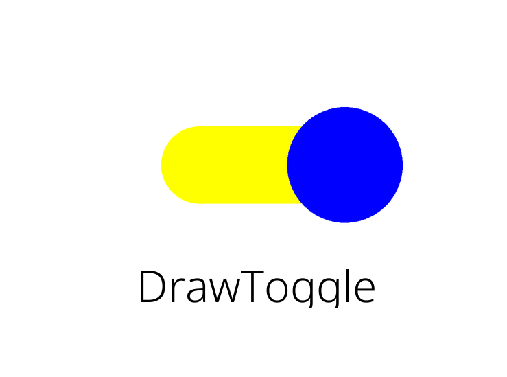
To start, name the element class DrawToggle. Since it will look like a toggle switch, say it will have three colors.
A
handle_color, which will be the color of the circle handleAn
on_color, which will be the color of the toggle slider when it ison.An
off_color, which is the color of the toggle slider when it isoff.
Since this element will be a toggle, it makes sense for it to have an element action to do so.
And there will need to be a variable to keep track of whether it is on or off.
With that determined, it is time to start setting up the element.
DrawToggle¶ 1class DrawToggle(Element):
2 """An example of how to make a custom element.
3 """
4
5 shorthand_actions = Element.action_shorthands | {"toggle": "toggle"}
6
7 def __init__(self, handle_color: ColorType = "blue", on_color: ColorType = "yellow", off_color: ColorType = "red", **kwargs):
8
9 ##This passes all keyword arguments to the base Element init.
10 ##This has to always be called to set all required properties correctly.
11 super().__init__( **kwargs)
12
13 self.handle_color = handle_color
14 self.on_color = on_color
15 self.off_color = off_color
16
17 self.__toggleState = True
In the setup, shorthand_actions is used to tell inkBoard what string actions this element has, and to what methods they map.
Furthermore, the __init__ method of the base Element is called, which takes care of defining all the required internal variables that handle the logic.
This is required for any element. At which moment it happens does not matter, so long as it is actually called.
By using the **kwargs in DrawToggle.__init__ and subsequently passing it to Element.__init__,
all default properties like id, background_color and the like can be defined in the config and set by the element without the need to repeat the arguments ad nauseam.
Afterwards, the values passed in the config of the element are set to their respective color property.
__toggleState will be used to track the state internally, with True meaning it is on, and False meaning it is off.
Now it is time to define the properties of the element. inkBoard itself generally uses the following conventions when naming properties:
snake_casefor properties that can be setcamelCasefor properties that should not be directly set
Following this convention, toggleState will be camelCase, since it should only be changed by calling the toggle function.
The color properties, however, can be snake_case.
DrawToggle¶ 1 @property
2 def toggleState(self) -> bool:
3 "The current state of the toggle"
4 return self.__toggleState
5
6 @colorproperty.NOT_NONE
7 def handle_color(self) -> ColorType:
8 "Color of the toggle circle"
9 return self._handle_color
10
11 @colorproperty
12 def on_color(self) -> ColorType:
13 "Color of the slide part when the toggle is on"
14 return self._on_color
15
16 @colorproperty
17 def off_color(self) -> ColorType:
18 "Color of the slide part when the toggle is off"
19 return self._off_color
Note the decorator used for the color properties, @colorproperty.
This decorator takes care of applying a setter function automatically, if none is defined.
This function takes care of validating if a color is valid, and assigns the value to the appropriate attribute.
Hence when defining a colorproperty, always return the attribute via the convention def my_color -> return self._my_color.
The handle_color is given the NOT_NONE variant of the property, which indicates the value cannot be None (meanign no color).
Keep in mind, the string value "None" will automatically convert to None in colors.
To make the element toggleable when clicked on, the methods to toggle the element have to be defined, and interactions with it need to be caught.
1 def toggle(self):
2 """Non async method for toggling.
3 """
4 self.__toggleState = not self.__toggleState
5 self.update(updated=True)
6 return
7
8 async def async_toggle(self):
9 "Toggles the element, but uses async. Generally preferred."
10 self.__toggleState = not self.__toggleState
11 await self.async_update(updated=True)
12
13 @elementaction
14 def tap_action(self):
15 "The function to call when tapping (short clicking) the toggle"
16 self.toggle()
17 return self._tap_action
The two toggle functions are quite straightforward. self.__toggleState is simply set to the opposit value of what it is currently.
Since it is has a double leading underscore, the variable cannot be accessed by other classes than the DrawToggle.
Since the update methods are defined in Element, it cannot be passed via updateAttributes.
So, the new value is set in the toggle methods, and subsequently the update method is called with updated=True.
This signals to the method that the element was updated before calling the update function, and will force it to generate its image again.
Although the class has both toggle and async_toggle defined, it is not quite required to use async functions.
They can be complicated even if you know what you are doing.
But it makes resource management generally better, so long as you do not block the event loop by calling blocking functions like time.sleep or Image.open.
Anyhow, the last part of toggling is actually triggering the toggle when interacting with the element.
For this, the elements tap_action property will have to be redefined.
Like color properties, element actions also have a convenience decorator, @elementaction.
This again will take care of applying a default setter, that will process element action dicts as explained before, and validate if a string function actually exists.
In this case, only the property getter is overwritten, and not in any complicated way.
It simply calls self.toggle() when the tap_action is requested, which (should) only be done when interacting with it.
That basically implements the full functionality for a toggle. But when you add the element to your config, it will throw an error.
It is still missing its generator method, which is the method that actually draws the element, so it is rather important.
Lets set one up.
1 def generator(self, area = None, skipNonLayoutGen = False):
2
3 if area != None:
4 self._area = area
5
6 [(x,y),(w,h)] = self.area
A usual starting point for an element is to check if it is passed an area.
The self._area attribute is actually also set by parent layouts, however defining it in code can also allow users to generate the element without starting up a full inkBoard session.
Now, the size of the element has to be gotten from the area, which is a PSSMarea.
The width and height are in the latter tuple.
1 background_color = Style.get_color(self.background_color, self.screen.imgMode)
2 base_img = Image.new(self.screen.imgMode, (w,h), background_color)
3
4 if self.toggleState:
5 slide_color = self.on_color
6 else:
7 slide_color = self.off_color
8 slide_color = Style.get_color(slide_color, base_img.mode)
9
10 relative_height = "h*0.4"
11 relative_width = "w*0.5"
12 (slider_h, slider_w) = self._convert_dimension((relative_height, relative_width))
With that, the base image can be set up. Since inkBoard allows defining custom color shorthands, calling Style.get_color is required.
This function takes care of converting any kind of valid color value into an appropriate representation for the kind of image.
The mode of the image may need to be kept in mind. It will generally be "RGBA", but in case it changes how an element functions, you may need to check for this.
The appropriate image mode can be gotten from the screen instance, which is an attribute that every element has.
With that, Image.new is called to create the base image with the appropriate background_color.
1 if self.toggleState:
2 slide_color = self.on_color
3 else:
4 slide_color = self.off_color
5 slide_color = Style.get_color(slide_color, base_img.mode)
6
7 relative_height = "h*0.4"
8 relative_width = "w*0.5"
9 (slider_h, slider_w) = self._convert_dimension((relative_height, relative_width))
10
11 x_c, y_c = (int(w/2), int(h/2))
12 xy = [(x_c - int(slider_w/2), y_c - int(slider_h/2)), (x_c + int(slider_w/2), y_c + int(slider_h/2))]
13
14 DrawShapes.draw_rounded_rectangle(base_img, drawArgs={"fill": slide_color, "xy": xy})
To get started with drawing the toggle itself, first the appropriate color for the slide part should be determined, base on the toggle state.
The slider should not take up all available space. In the example, the values are hardcoded to be 40% of the available height and 50% of the available width.
To convert these values to values that can be used by Pillow, call self._convert_dimension.
This converts dimensional strings into the correct pixel values for the element.
With those values, the coordinates of the slider can be calculated.
Pillow expects a bounding rectangle for drawing rectangles.
To determine these, first determine the center coordinates of the image.
Then, using the previously calculated width and height, setup the corner coordinates.
The upper left corner is the center x coordinate minus half the slider width and the center y coordinate minus half the slider height.
The lower right corner follows the same convention, but instead adds to the center coordinates.
With that done, call DrawShapes.draw_rounded_rectangle.
The DrawShapes library is a tool for inkBoard that takes care of drawing shapes in decent resolution, since drawing with ImageDraw does not always yield nice results.
The library simply implements some minor anti aliasing.
Note
When programming with images, the usual convention is having the origin (0,0) located in the upper left.
1
2 if self.toggleState:
3 circle_x = xy[1][0]
4 else:
5 circle_x = xy[0][0]
6
7 circle_r = int(slider_h*0.75)
8
9 circle_xy = [(circle_x - circle_r, y_c - circle_r), (circle_x + circle_r, y_c + circle_r)]
10 circle_col = Style.get_color(self.handle_color)
11 DrawShapes.draw_circle(base_img, {"xy": circle_xy, "fill": circle_col})
12
13 return base_img
What is left is drawing the handle in the correct place.
When it is on, the handle should be on the right, and when it is off, it should be on the left.
Again, first calculate the correct coordinates. Currently the draw_circle method is somewhat outdated, and does not accept center coordinates for a circle.
Hence, a bounding rectangle has to be calculated again, circle_xy.
The x coordinate is simply the left or right coordinate of the slider.
That means the bounding box can be calculated from the image’s center height and circle_x using the radius circle_r, which is set to be 75% of the slider’s height.
This means the full circle will be 150% of the height of the slider.
The color is gotten from self.handle_color, and from there call DrawShapes.draw_circle.
Finally, return the base_image. The DrawShapes functions have drawn all the shapes on the base image, so it can be returned as is.
That’s it! The element can now by used by specifying type: custom:DrawToggle.
The full DrawToggle class
 1class DrawToggle(Element):
 2    """An example of how to make a custom element.
 3    """
 4
 5    shorthand_actions = Element.action_shorthands | {"toggle": "toggle"}
 6
 7    def __init__(self, handle_color: ColorType = "blue", on_color: ColorType = "yellow", off_color: ColorType = "red",  **kwargs):
 8
 9        ##This passes all keyword arguments to the base Element init.
10        ##This has to always be called to set all required properties correctly.
11        super().__init__( **kwargs)
12
13        self.handle_color = handle_color
14        self.on_color = on_color
15        self.off_color = off_color
16
17        self.__toggleState = True
18
19 @property
20 def toggleState(self) -> bool:
21 "The current state of the toggle"
22 return self.__toggleState
23
24 @colorproperty.NOT_NONE
25 def handle_color(self) -> ColorType:
26 "Color of the toggle circle"
27 return self._handle_color
28
29 @colorproperty
30 def on_color(self) -> ColorType:
31 "Color of the slide part when the toggle is on"
32 return self._on_color
33
34 @colorproperty
35 def off_color(self) -> ColorType:
36 "Color of the slide part when the toggle is off"
37 return self._off_color
38
39
40 def toggle(self):
41 """Non async method for toggling.
42 """
43 self.__toggleState = not self.__toggleState
44 self.update(updated=True)
45 return
46
47 async def async_toggle(self):
48 "Toggles the element, but uses async. Generally preferred."
49 self.__toggleState = not self.__toggleState
50 await self.async_update(updated=True)
51
52 @elementaction
53 def tap_action(self):
54 "The function to call when tapping (short clicking) the toggle"
55 self.toggle()
56 return self._tap_action
57
58
59 def generator(self, area = None, skipNonLayoutGen = False):
60
61 if area != None:
62 self._area = area
63
64 [(x,y),(w,h)] = self.area
65
66 background_color = Style.get_color(self.background_color, self.screen.imgMode)
67 base_img = Image.new(self.screen.imgMode, (w,h), background_color)
68
69 if self.toggleState:
70 slide_color = self.on_color
71 else:
72 slide_color = self.off_color
73 slide_color = Style.get_color(slide_color, base_img.mode)
74
75 relative_height = "h*0.4"
76 relative_width = "w*0.5"
77 (slider_h, slider_w) = self._convert_dimension((relative_height, relative_width))
78
79 x_c, y_c = (int(w/2), int(h/2))
80 xy = [(x_c - int(slider_w/2), y_c - int(slider_h/2)), (x_c + int(slider_w/2), y_c + int(slider_h/2))]
81
82 DrawShapes.draw_rounded_rectangle(base_img, drawArgs={"fill": slide_color, "xy": xy})
83
84 if self.toggleState:
85 circle_x = xy[1][0]
86 else:
87 circle_x = xy[0][0]
88
89 circle_r = int(slider_h*0.75)
90
91 circle_xy = [(circle_x - circle_r, y_c - circle_r), (circle_x + circle_r, y_c + circle_r)]
92 circle_col = Style.get_color(self.handle_color)
93 DrawShapes.draw_circle(base_img, {"xy": circle_xy, "fill": circle_col})
94
95 return base_img
The Result
With that done, combine it all in your tutorial.yaml. Add a LabeledElements with a DrawToggle inside an give it a custom tap_action.
Ensure the layout is added to the main_tabs, run the config and open the appropriate tab.
- type: custom:LabeledElements
  id: my-custom-elements
  rows: 1
  columns: 1
  outer_margins: 100
  elements:
    - type: custom:DrawToggle
      tap_action: custom:my_print_function
This is the resulting labeled DrawToggle: