Designing
With a base configuration written, it is time to actually utilise it as a dashboard. More elements will be added, interactivity will be configured as well, and styling options will be explained. First, a basic workflow for designing a dashboard will be gone through, after which those complexer features will be explained.
But first, start inkBoard designer by running this command. You should be greeted by the opening screen.
inkBoard designer
Tip
You can open a configuration file immediately by running
inkBoard designer path/to/configuration/file.yaml

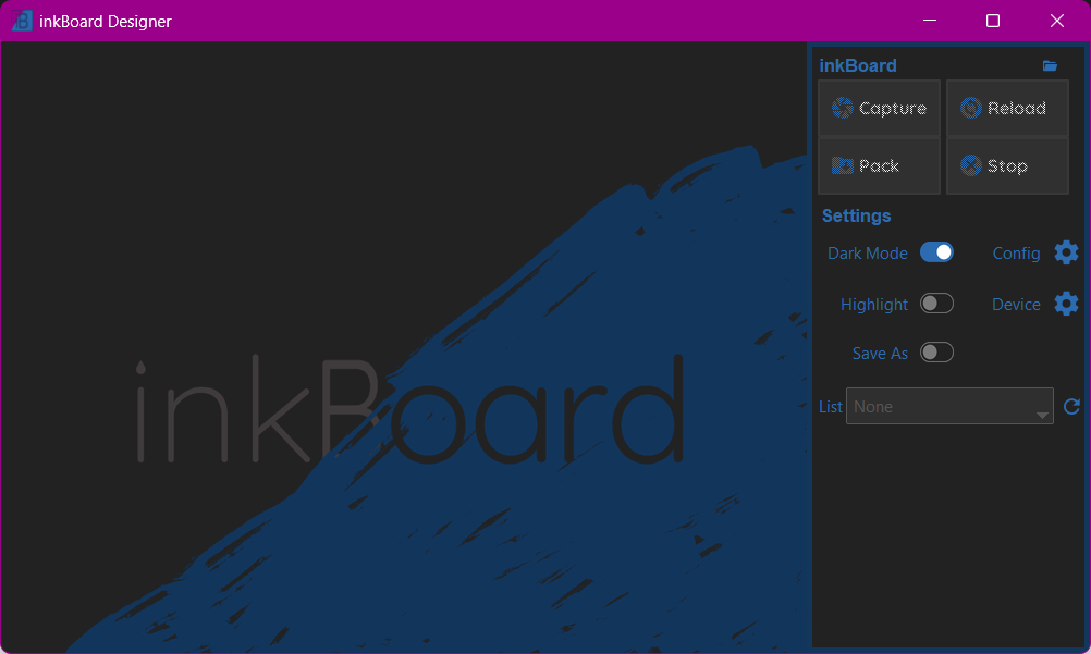
The top four buttons are currently disabled, since there is no configuration selected.
You can toggle around the settings if you want though, although for now only the Dark Mode toggle will do something.
Lets load the configuration from the previous section. Press the folder icon in the top right and open tutorial.yaml.
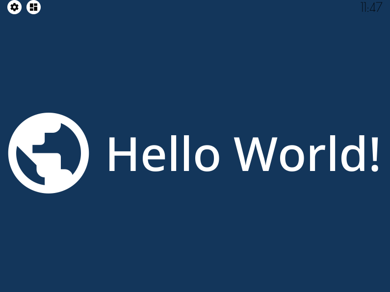
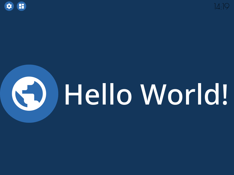
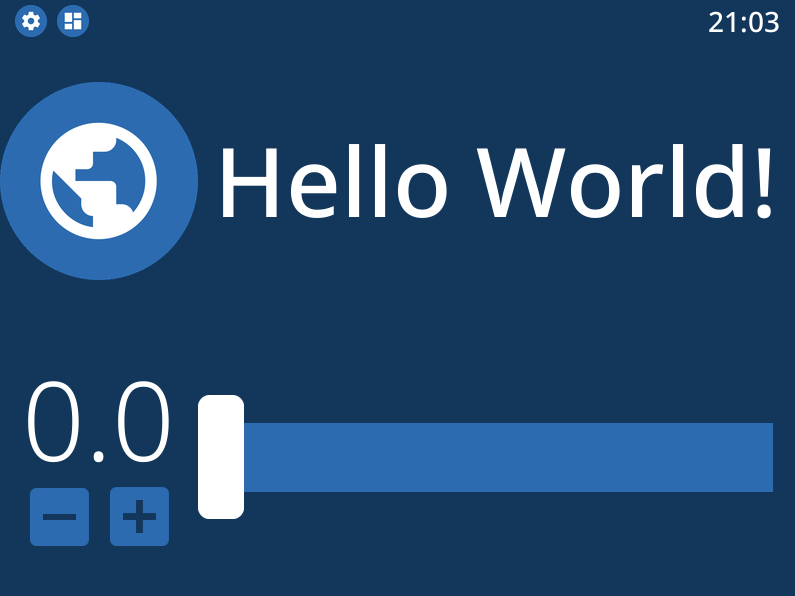
If the configuration was setup correctly, you should see the dashboard below.
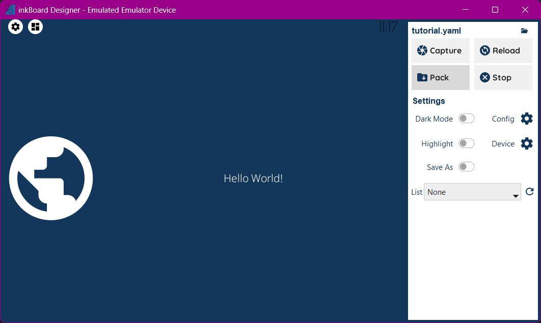
That is not very impressive yet, of course. Lets start with fixing up the current elements. Then, implement some interaction, and start adding more complex elements.
Design Workflow
inkBoard, and especially the designer, tries to make iterating over dashboard designs as smooth as possible. You may have already noticed the Reload button in the top right. It does exactly what you think, namely reloading the configuration. Lets make some changes to the dashboard, and put it to use.
Styling an Icon
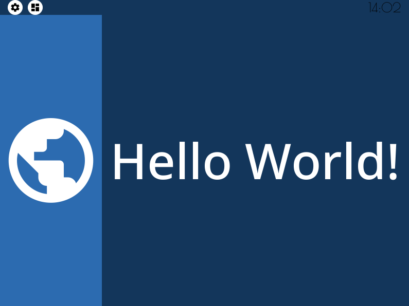
my-icon and my-button are both still somewhat floating about on the dashboard. To seperate them a bit more, give my-icon its own background color.
This can be done by applying background_color. If only the background_color property is set, the entire space of the element will be filled with said color.
In this case, that is a bit much, so to limit the background space, Icon elements can be given a background_shape property. A circle matches quite well with the round globe.
my-icon¶- type: Icon
id: my-icon
icon: mdi:earth
icon_color: white
background_color: inkboard-light
background_shape: circle
Important
Not every element allows the use of background_shape (yet). For Button elements and base Layout elements, the radius property does allow using rounded corners.
The advantage of them is that not the entire element’s background is usually filled, but instead they use the space required to encompass the visible parts of the element.
Currently, the following values for background_shape are implemented:
circle(ImageDraw.pieslice)square(ImageDraw.rectangle)rounded_square(ImageDraw.rounded_rectangle)rounded_rectangle(ImageDraw.rounded_rectangle)octagon(ImageDraw.regular_polygon)hexagon(ImageDraw.regular_polygon)none, meaning background shapeADVANCED, allows for complicated usage
By setting the shape_settings property, you can further configure how the shape is drawn.
Every shape (except ADVANCED) has default settings, but those can also be overwritten.
See the appropriate function in Pillow’s ImageDraw Module. When using ADVANCED, supply the method argument to shape_settings, which has to be the string value of one of the methods of ImageDraw.
Styling the StatusBar
All that is left is to make the statusbar match the dashboard some more. First off, apply a bit of a margin on the top of it, such that the icons have a little more free space. To keep the icons roughly the same size, increase its size too. By default, the statusbar gets 5% of the available space. Increase it to 7.5%.
statusbar:
 outer_margins: [5, 10]
 size: "?*0.075"
To make the icons in the statusbar match my-icon, the status_element_properties property can be used. This property applies the set properties to all the icons in the statusbar.
By setting the statusbar’s foreground_color, it is possible to use this value in child elements. By setting it to white, and subsequently setting icon_color to foreground, the parent’s foreground_color is used for the color value.
The same concept is used to set the background_color to the accent_color of the statusbar.
statusbar:
 outer_margins: [5, 10]
 size: "?*0.075"
 foreground_color: white
 accent_color: inkboard-light
 status_element_properties:
   icon_color: foreground
   background_color: accent
   background_shape: circle
Important
Elements within layouts have access to the color properties of their parent layout. For example, an icon can take on its parent layout’s background_color by setting icon_color to background.
Any color property of a layout is available as a shorthand as the name of that property minus the _color part. See the documentation for a specific element to see which color properties are available.
Finally, to make the clock’s style match that of my-button, a similar property will be used. Via element_properties, certain layout type elements allow for styling elements within them.
This is mainly meant for layout elements with specific usage, like the Counter, so more explanation to how they work will come later.
For now, the font_color is set to foreground as well, and the same font as my-button will be used.
statusbar:
 outer_margins: [5, 10]
 size: "?*0.075"
 foreground_color: white
 accent_color: inkboard-light
 status_element_properties:
   icon_color: foreground
   background_color: accent
   background_shape: circle
 element_properties:
   clock:
     font_color: foreground
     font: default-bold
Continueing the Workflow
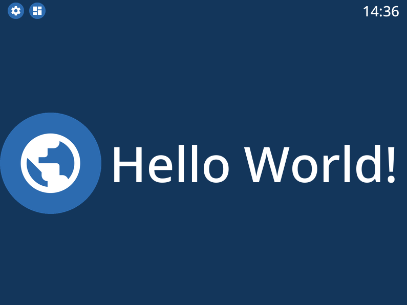
Once you get the hang of styling elements, all those reloads and intermediate steps won’t become as necessary. inkBoard tries to make its logs as usable as possible, especially for configuration errors, so if things don’t work, keep an eye on that. The dashboard resulting from all the steps in the previous section can be seen in the dropdown below.
Resulting Dashboards
The font is a bit oversized
fit_text fixes that
Fully applying a background color may be overdoing it somewhat
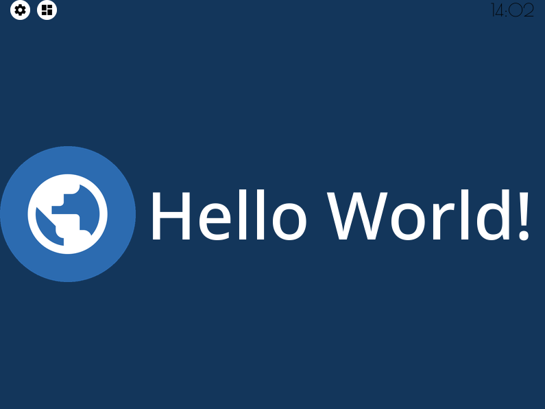
A background_shape looks more in place
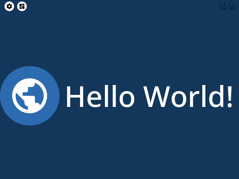
A bit more space for the statusbar
Styling the status elements
Styling the statusbar clock
Designing a Dashboard
Styling isn’t all inkBoard can do. Nor are Icon and Button the only two available elements (as a matter of fact, a DigitalClock element has been styled too).
But to get a better feel for the more complex features, the dashboard needs more elements, those elements need to be configured, and stuff needs to actually work.
Element Actions
Although inkBoard dashboards work fine with just displaying data, they are generally meant to be interactive.
By default, a couple of functions are available through the YAML syntax, which are referred to as shorthand_functions.
A few default ones are added, like quit and reload, as well as some that depend on whether a platform supports certain features. For example, if a device supports the backlight feature, shorthands like backlight-toggle are also available.
Adding a shorthand to an element is quite simple.
For example, adding reload to my-icon to reload the config on press is done by setting tap_action to reload.
To add feedback on interaction, set show_feedback to true.
tap_action to my-icon¶- type: Icon
id: my-icon
icon: mdi:earth
icon_color: white
background_color: inkboard-light
background_shape: circle
show_feedback: true
tap_action: reload
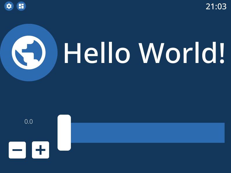
If you clicked around in the dashboard before, you may have noticed that the icons in the statusbar already are interactive, and open a menu when tapped on.
To explain how to mimick that behaviour, first add the popups entry, and make a PopupMenu element,
which inherts from the base Popup element.
Popup element¶popups:
- type: PopupMenu
id: my-popup
title: "Hello World!"
menu_layout:
type: GridLayout
elements:
- type: Button
text: Again!
id: my-popup-button
Important
Popup elements are simply Layout elements with added functionality to print them on top of whatever is currently on screen, and determine their size and position more directly.
This is a very simple element, but if you reload the dashboard, it does not appear. To make that happen, it has to be shown somehow.
To do so, the show shorthand function of my-popup can be linked to the tap_action of my-icon.
For this, the shorthand function identifier element: needs to be used, and the appropriate element_id needs to be set for the tap_action.
Tip
Like with custom elements, custom functions can be parsed via the identifier custom:, so using a custom tap_action can be done by setting tap_action: custom:my_action. Integrations may add function groups via similar identifiers.
tap_action of my-icon¶- type: Icon
id: my-icon
icon: mdi:earth
icon_color: white
background_color: inkboard-light
background_shape: circle
show_feedback: true
tap_action:
action: element:show-popup
element_id: my-popup
When tapping my-icon now, my-popup appears! The syntax for elementactions is the same for all interaction actions, so a tap_action and hold_action can do the same using (roughle) the same config.
However, elementactions can also be used with certain elements to automate them. In general, this goes for element properties starting with on_.
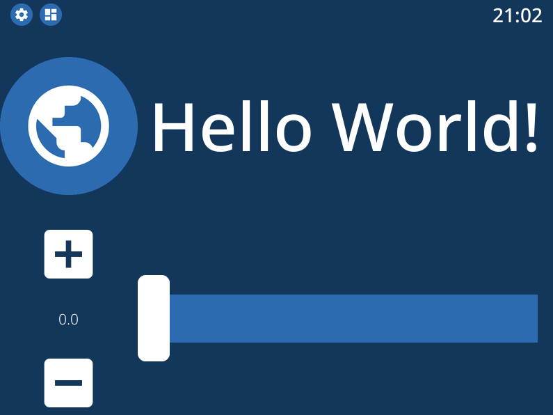
To show this off, add a Counter and a Slider element to your dashboard. Don’t forget to update my-layout and add them.
Slider and a Counter¶- type: Counter
id: my-counter
minimum: -10
maximum: 10
foreground_color: foreground
on_count:
action: element:set-position
element_id: my-slider
- type: Slider
id: my-slider
minimum: -10
maximum: 10
color: accent
thumb_color: foreground
on_position_set:
action: element:set-value
element_id: my-counter
Hint
my-slider and my-counter do not show up
my-layout to add the new elements¶- type: GridLayout
foreground_color: white
accent_color: inkboard-light
rows: 2
columns: 2
column_sizes: [w/4, "?"]
id: my-layout
elements:
- my-icon
- my-button
- my-counter
- my-slider
When changing the value of my-counter, my-slider updates to reflect that value too, and the same happens vice-versa.
element_actions are more powerful than just calling some functions, however. Using the data and map keys, it possible to pass parameters to the called functions.
To do so, update my-counter such that the text of my-button is changed whenever its value changes. This can be done via the data key, since the text is a value that does not change.
my-slider will update the the text of my-button to the current slider position. Since this means a value is mapped to a property of the element, the map key is used. The position property of the slider is the current value of the slider, so the text key under map should have the value position.
Attention
If you pass any parameters that a function does not accept, an error will be thrown and the function will not be called. This is not validated when setting a function, so you will only be notified in the logs when the error happens.
data and map key in an elementaction¶- type: Counter
id: my-counter
minimum: -10
maximum: 10
foreground_color: foreground
on_count:
action: element:update
element_id: my-button
data:
text: Count me in!
- type: Slider
id: my-slider
minimum: -10
maximum: 10
color: accent
thumb_color: foreground
on_position_set:
action: element:update
element_id: my-button
map:
text: position
Interacting with the two elements should now change the text displayed on my-button. The shorthand function element:update updates the element’s properties to the values passed via data and map, and is available for any element.
The previous example, that linked the values of my-counter and my-slider, can also be achieved by using the element:update shorthand. If you want to experiment more with elementactions, try getting that to work, for example.
For available elementactions, take a look at the documentation for the elements. The same goes for available shorthand actions.
Important
elementactions can be defined to call a function or do something when they are interacted with. Certain elements also have actions that allow automation, for example when their value changes.
Look for element properties that end on *_action for interactable actions, and properties that start with on_* for automation actions.
The data key for an elementaction can be used to pass directly defined values to the called function. This always happens by passing the value as a keyword, so be careful to check if the called function accepts said keyword.
map functions similar to data. However, instead of passing a defined value, it maps the value of the key to the value of the matching property of the element.
Resulting Dashboards
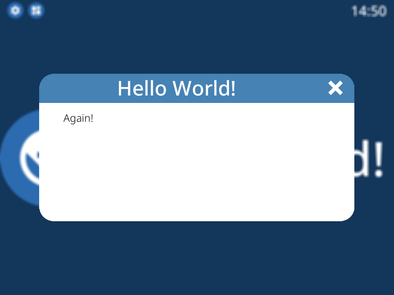
Opening a popup via a tap_action
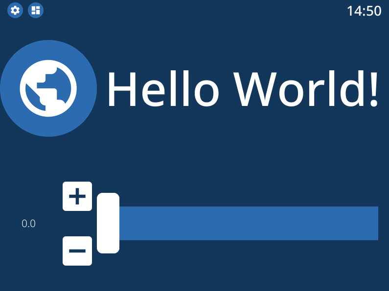
Adding a Counter and Slider element
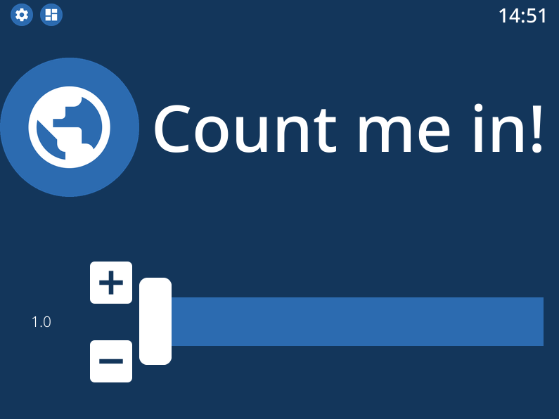
Setting the text of my-button via a data key
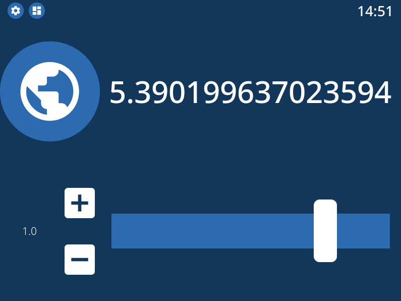
Setting the text of my-button via a map key
Tiles
A type of element that you will run into quite often is the TileElement.
This is not a directly usable element, but rather one that others often inherit from. They can be recognised by having the property tile_layout.
The purpose of a tile_layout is to allow having layout elements with predefined elements and functionality, whilst keeping the ability to easily customise the placements of their elements.
The Counter added in the previous section is an example of this.
To use a tile_layout, first take note of the “tiles” present in the element. These are simply the smaller elements that form the tile_layout.
For a Counter these are count, which is the Button that displays the value, up, the Icon used to increment the value, and down, the Icon used to decrement the value.
Most default tiles also provide a few default layouts, which are shorthands for some predefined layouts. For Counter, that is default, the layout my-counter has been using, and horizontal, which aligns the three elements in a single row.
For a Counter, a tile_layout value of default is equivalent to the value "count,[up;down]". For horizontal, the equivalent layout string is "down,count,up". This may give you a hunch as to how these strings are parsed.
But as an example, say you want a vertical layout, which is the equivalent vertical version of the horizontal layout. For that, the layout string would be "up;count;down". The difference between the two layout strings is in the delimiter between the tiles. For horizontal, a , has been used, whereas for vertical a ; has been used.
So, to order tiles horizontally, seperate them by a ,, which puts them in the same layout row. To order them vertically, seperate them by a ;.
The main power of the tile layout parser lies in the last seperator, however. That is [, or technically, the combination of [ and ]. Encompassing tiles within square brackets tells the parser to put them in a layout of their own.
This means it is possible to have a two elements stacked vertically in a single row with another element, like in the default layout.
So, say you want the count tile on top of both the Icon elements. To achieve that, a tile_layout like "count;[down,up]" can be used.
Using this value already parses the wanted layout, however the proportions of the tiles are not quite balanced. For this, the properties horizontal_sizes and vertical_sizes of a TileElement can be used.
These properties can allow either the horizontal size of an element or its vertical size to be set. Aside from the available tiles, the keys outer and inner can also be passed to set the outer and inner margins respectively.
To fix the propertios of my-counter a bit, apply a horizontal and vertical outer margin, and allow the count tile to take up 60% of the available vertical space. Do the latter by setting its vertical_sizes key to "?*1.5".
Any sublayout is given a height of "?", so the ratio of the elements can be set by making use of that. Using a dimensional string with h in it is also possible, however in that case you will need to take the margins into account.
Note
Updating horizontal_sizes or vertical_sizes will only update the passed values. Previously set values will remain as they were.
Note
Due to how layouts work internally, a vertical size can only be applied per row, so they are only used when a tile takes up its a full row.
tile_layout and sizing to my-counter¶- type: Counter
id: my-counter
tile_layout: count;[down,up]
horizontal_sizes:
outer: w*0.1
vertical_sizes:
count: "?*1.5"
outer: h*0.15
...
Whilst it looks better now, the value of the counter is still too small. It does not have to do with the size of the elements, really, moreso there styling.
The count tile, which is a Button element, simply still uses the default font_size. To style it, the element_properties property can be used. In a way, you have already used this, when styling the statusbar clock.
Although a statusbar is not a TileElement the syntax for element_properties is the same. To style the count tile, apply the desired properties to it via element_properties.
To apply a different color to the up and down Icon tiles, follow the same process to set their respective icon_color. This syntax works as even with nested TileElements, so styling of individual tiles is generally always possible.
You may need to apply the accent_color to the counter as shown, to make it use the one from its parent layout.
my-counter.¶- type: Counter
id: my-counter
accent_color: accent
...
element_properties:
count:
font_size: 0
fit_text: true
down:
icon_color: accent
up:
icon_color: accent
...
Tip
The TileLayout element allows you to make a layout using the tile_layout parser. To do so, configure the elements within it via the elements key and set the tile_layout as desired.
.. code-block:
- type: TileLayout
  elements:
    element-1:
      type: Button
      ...
    element-2:
    ...
  tile_layout: ...
Important
- A
TileElementallows creating a layout by setting thetile_layoutproperty. Include the available tiles of an element, and create thetile_layoutvia the following rules: Seperate them horizontally using a
","Seperate them vertically using a
";"Seperate multiple elements from another by enclosing them within square brackets (
"["and"]")
To style elements withint a TileElement, use the appropriate key for the tile you want to style, and set its properties from there.
Resulting Dashboards
Stacking tiles vertically
A custom tile_layout with appropriate sizing
Styling tiles using element_properties
Main Tabs & StatusBar
In the previous chapter’s section main_tabs & statusbar were introduces briefly. With the basic tools to design elements under your belt, these can be styled too.
The main_tabs is meant to quickly set up a basic interface that allows easy navigation between various dashboards. When setting it up, however, the navigation bar was hidden, and only one tab was included, so this was not very obvious.
In general, the idea is to include layouts by referencing them by their id, but for simplicity’s sake a tab will be added that just shows the time.
main_tabs¶main_tabs:
hide_navigation_bar: false
foreground_color: white
accent_color: inkboard-light
tabs:
- element: my-layout
name: My Layout
icon: mdi:clipboard-text
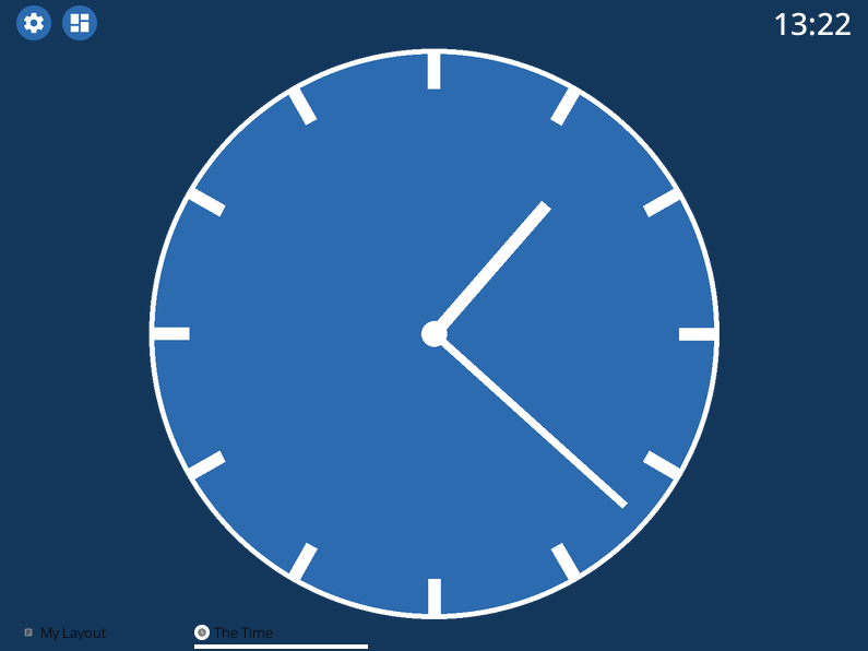
- name: The Time
icon: mdi:clock
element:
type: AnalogueClock
minimum_resolution: 1000
clock_fill_color: accent
outline_color: foreground
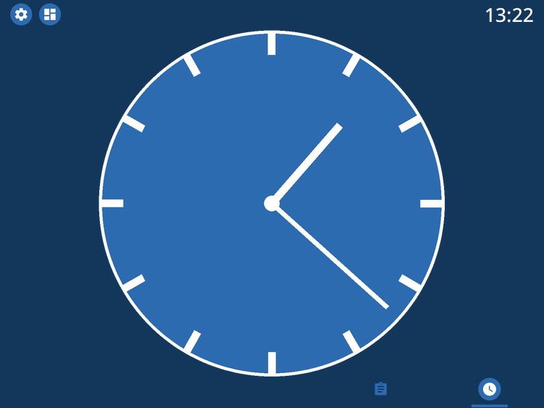
On the bottom of the screen, there is now a bar which shows the tabs with name and icon. Clicking on The Time will switch the current view to that tab.
The TabPages element is a TileElement, meaning it can be styled as such.
There are a few convenience properties, like hide_navigation_bar and hide_page_handles, which simply change the value of the hide property.
Available tiles are navigation, handle-next, handle-previous and tab. The navigation tile is the bar on the bottom.
To increase its size, use the vertical_size property. Styling it is a little different, however.
The tile itself is a GridLayout, however the element is wrapped to also be an ElementSelect.
This is a more advanced elements that allows for selecting other elements.
For styling, it comes with two additional properties, active_properties and inactive_properties, with respective color properties active_color and inactive_color.
Styling for active_properties is applied to all elements that are selected, and inactive_properties is applied to all that are not selected. For the navigation tile, when a new tab is selected by clicking on it, the other tab is automatically deselected.
The two handle tiles are Icon elements that go to the previous or next page. Using the shorthand functions of the TabPages it also possible to automate showing a tab.
For the example, the NavigationTile elements are given a custom layout, and their coloring is changed. The elements will also be aligned to the right side of the bar.
main_tabs:
  hide_navigation_bar: false
  foreground_color: white
  accent_color: inkboard-light
  apply_default_sizes: false
  vertical_sizes:
    navigation: h*0.08
  element_properties:
    navigation:
      active_color: accent
      outer_margins: [0, 0, 0, "w*0.6"]
      active_properties:
        element_properties:
          icon:
            icon_color: white
      inactive_properties:
        element_properties:
          icon:
            icon_color: inkboard-light
      option_properties:
        tile_layout: icon;line
        horizontal_sizes:
          outer: "?"
        vertical_sizes:
          icon: h*0.75
          inner: 5
   tabs:
    ...
Tip
Setting the foreground_color and accent_color of the main_tabs also means the colors of my-layout can be set by referencing these colors.
The statusbar entry puts a StatusBar element on the same level as the main tabs, meaning it stays visible when switching tabs.
For the config entry, two additional options can be passed, size and location. Both are more or less self explanatory. There are 4 options for the location, top, bottom, left and right.
Size takes any valid dimension value, but by default it takes up 5% of the available space. Move if to the left side of the screen, and adjust the margins accordingly.
Styling a statusbar is done via the element_properties syntax. The clock has already been styled, but the icons can be styled as well. By default, two status elements are available: device and inkboard.
The device icon is a special type, namely a DeviceIcon. These can monitor and show the status of certain device features. A useful one may be to show the status of the network connection.
statusbar:
  outer_margins: [10, 5]
  size: "?*0.075"
  location: left
  foreground_color: white
  accent_color: inkboard-light
  status_element_properties:
    icon_color: foreground
    background_color: accent
    background_shape: circle
  element_properties:
    clock:
      font_color: foreground
      font: default-bold
    device:
      icon_feature: network
Important
Both main_tabs and statusbar entries act as a shorthand to setup the base layout of a dashboard.
The navigation tile of a TabPages element is a selector element, and allows styling of its elements by applying active_properties and inactive_properties.
In case of navigation, the internal tiles are NavigationTiles, and thus allow styling via the tile syntax. Its tiles are name, icon and line. For TabPages, the tiles are navigation, handle-next, handle-previous and tab.
A StatusBar is not a TileElement, however it does allow styling via the element_properties syntax. Status icons are added to it via inkBoard itself or by integrations.
Resulting Dashboards
Adding a new tab
Styling the navigation bar

Styling the statusbar and editing the device icon
Designer UI
Before ending this section, lets quickly go over the designer’s ui. At the time of writing, this is still a work in progress, so not every button is fully functional yet. Things are also still likely to change depending on new ideas or functionality added. In Designer Interface Functions, the functions of the buttons (numbered as in the image) can be seen.
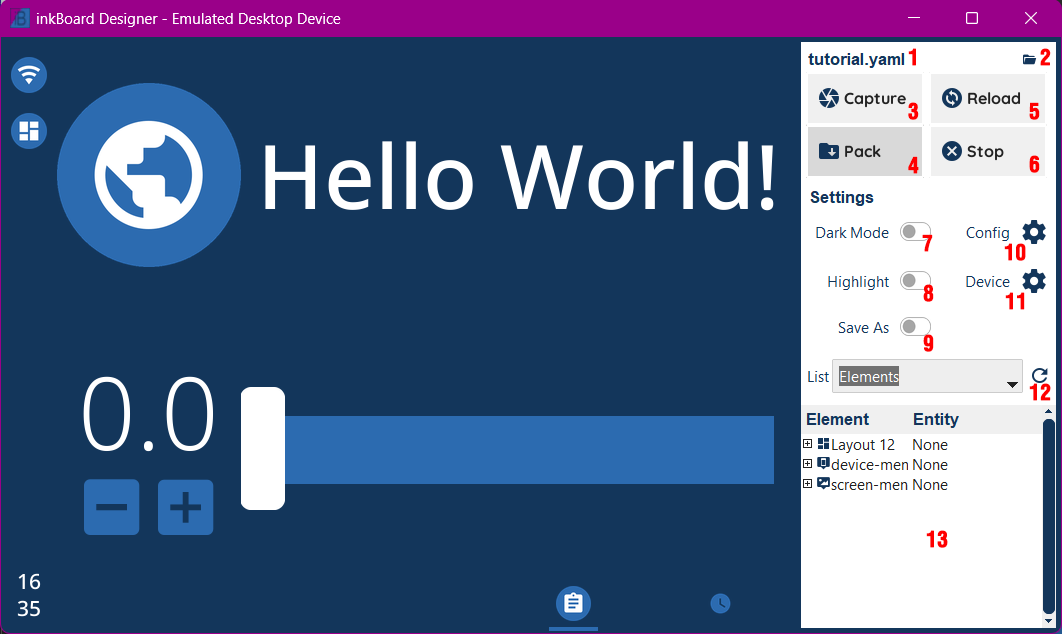
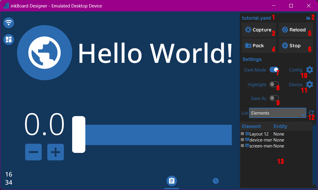
Number |
Desciption |
Usage |
|---|---|---|
1 |
Configuration file name |
Shows the currently loaded dashboard configuration file. Click it opens the folder of said file (at least on windows) |
2 |
Folder Icon |
Opens a dashboard file and runs it |
3 |
Capture |
Makes a screenshot of the current dashboard view |
4 |
Pack |
Creates a package of the currently loaded config. Packages all files currently, so the required platform folder, imported integrations, and all files in the configuration file folder. |
5 |
Reload |
Reloads the configuration of the currently running config |
6 |
Stop |
Stops the current running config |
7 |
Dark Mode |
Toggles Dark Mode |
8 |
Highlight |
Toggles element highlighting when selecting an element from a compatible treeview item. |
9 |
Save As |
If turned on, this will allow specifying the filename and location of any screenshots or element images being saved. Otherwise they are automatically saved in the screenshots folder of the config |
10 |
Config |
Opens a window with information on the current config. The window is not yet implemented. |
11 |
Device |
Shows info on the device, and allows changing certain behaviours of the emulator. |
12 |
Tree List |
Selects which treeview to show below. |
13 |
Treeview Area |
If selected, shows a treeview with certain info. The |
The Base Configuration
With this section done, you have a basic dashboard with functionality, and hopefully you feel more confident in designing your own. To wrap up the basics of running inkBoard, all that is needed is knowing how to run the actual dashboard. The next section on packaging will briefly explain how to get it all up and running. Depending on your platform of choice, the difficult parts should be out of the way now, though!
Tutorial/tutorial.yaml
  1inkBoard:
  2  name: inkBoard Tutorial
  3
  4device:
  5  platform: emulator
  6
  7screen:
  8  background: inkboard
  9  minimum_hold_time: 1s
 10
 11elements:
 12  - type: Button
 13    id: my-button
 14    text: Hello World!
 15    font_color: white
 16    font_size: 0
 17    fit_text: true
 18    font: default-bold
 19
 20  - type: Icon
 21    id: my-icon
 22    icon: mdi:earth
 23    icon_color: foreground
 24    background_color: inkboard-light
 25    background_shape: circle
 26    show_feedback: true
 27    tap_action:
 28      action: element:show-popup
 29      element_id: my-popup
 30
 31  - type: Counter
 32    id: my-counter
 33    accent_color: accent
 34    tile_layout: count;[down,up]
 35    horizontal_sizes:
 36      outer: w*0.1
 37    vertical_sizes:
 38      count: "?*1.5"
 39      outer: h*0.15
 40    element_properties:
 41      count:
 42        font_size: 0
 43        fit_text: true
 44      down:
 45        icon_color: accent
 46      up:
 47        icon_color: accent
 48    minimum: -10
 49    maximum: 10
 50    foreground_color: foreground
 51    on_count:
 52      action: element:update
 53      element_id: my-button
 54      data:
 55        text: Count me in!
 56
 57  - type: Slider
 58    id: my-slider
 59    minimum: -10
 60    maximum: 10
 61    color: accent
 62    thumb_color: foreground
 63    on_position_set:
 64      action: element:update
 65      element_id: my-button
 66      map:
 67        text: position
 68
 69layouts:
 70  - type: GridLayout
 71    foreground_color: foreground
 72    accent_color: accent
 73    rows: 2
 74    columns: 2
 75    column_sizes: [w/4, "?"]
 76    id: my-layout
 77    elements:
 78      - my-icon
 79      - my-button
 80      - my-counter
 81      - my-slider
 82
 83popups:
 84  - type: PopupMenu
 85    id: my-popup
 86    title: "Hello World!"
 87    menu_layout:
 88      type: GridLayout
 89      elements:
 90        - type: Button
 91          text: Again!
 92          id: my-popup-button
 93
 94statusbar:
 95  outer_margins: [10, 5]
 96  size: "?*0.075"
 97  location: left
 98  foreground_color: white
 99  accent_color: inkboard-light
100  status_element_properties:
101    icon_color: foreground
102    background_color: accent
103    background_shape: circle
104  element_properties:
105    clock:
106      font_color: foreground
107      font: default-bold
108    device:
109      icon_feature: network
110
111main_tabs:
112  hide_navigation_bar: false
113  foreground_color: white
114  accent_color: inkboard-light
115  apply_default_sizes: false
116  vertical_sizes:
117    navigation: h*0.08
118  element_properties:
119    navigation:
120      active_color: accent
121      outer_margins: [0, 0, 0, "w*0.6"]
122      column_sizes: w*0.2
123      active_properties:
124        element_properties:
125          icon:
126            icon_color: white
127      inactive_properties:
128        element_properties:
129          icon:
130            icon_color: inkboard-light
131      option_properties:
132        tile_layout: icon;line
133        horizontal_sizes:
134          outer: "?"
135        vertical_sizes:
136          icon: h*0.75
137          inner: 5
138  tabs:
139    - element: my-layout
140      name: My Layout
141      icon: mdi:clipboard-text
142    - name: The Time
143      icon: mdi:clock
144      element:
145        type: AnalogueClock
146        minimum_resolution: 1000
147        clock_fill_color: inkboard-light
148        outline_color: white